Although cigars had been smoked in Europe and the U.S. since the 1760’s, there didn’t seem to be strong brand competition prior to the 1840’s. A cigar was a cigar and you took whatever you could get.  Cigars were advertised as Spanish, half-Spanish, Havannah, Manila, Hamburgh, Yara or common, all descriptions of how, where, or what they were made of. You might find mention of Regalias or Londres, the two most popular shapes, both about four inches long, the former straight, the later bulbous.  Cigars were rarely mentioned by brand name. In newspaper ads and government documents before 1840, I’ve seen only RIFLE and DOS AMIGOS in 1838 and LA CARONA [sic] in 1839.  By 1840, things were changing.
 
    Worldwide demand for Cuban cigars was huge, absorbing every cigar no matter the brand or quality. To fill that demand small cigar companies, factories and brokers, sprang up like daisies in spring, more than 1,000 of them by 1860. Every small town, and there were a lot of them, had a local roller. Larger factories called them chinchales (bedbugs), and their mortality was high, lasting about three years. Many partnerships were limited to a few transactions, a year or two. Everyone had hopes their brand would catch on in international trade so they could either start a family legacy-business or sell out for piles of money to some bigger company. Sound familiar?  A few succeeded, and are the subject of other NCM exhibits.
 
      The cigar makers of that day were truly advertising pioneers. Prior to that time there were no brand-name commercial products in competition in the marketplace with similar brand-name commercial products.  Admittedly, there were crudely printed paper sheets wrapped around smoking tobacco in the 1700’s, but those labels were primarily intended for identification, not display advertising. Cigars were the first product packed in containers intended to serve as marketing displays for contents sold individually. Everything the cigarmakers and brokers did, every decision they made, was ground breaking. The newly introduced combination of colored paper and German printing technology gave them the opportunity to create mass produced labels for the first time.  
 
        As pioneers they were forced to answer many basic questions, the answers to which would be taken for granted a quarter century later.
[1] Where did the label go on the box? [2] What shape should the label be?  [3] What color should it be?  [4] What image should be on the label? [5] What text should it have?  
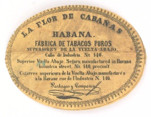
The earliest Cuban makers frequently believed they didn’t need a label with anything on it beyond their name; others were more adventurous, and in so being, founded modern package advertising.  This exhibit is a peek at a few of the answers they came up with. EARLY CUBAN LABELS II goes into further detail about early label design development. Labels in this exhibit date 1835-1868.
Early Cuban Labels:
the birth of modern advertising
A National Cigar Museum Exclusive
© Tony Hyman
 
Brand name only LONDRES, one of the two most popular sizes of cigars.  Signed Carvajal, though Melchor T. Luna is listed as maker.
[7405]
WASHINGTON MANUFACTORY and a portrait decorate this early box top label. This style and placement of the label does not seem to have been used after the 1850’s. Fortunately, the use of black ink on blue paper was also short-lived.  [7423]
Same brand and box, with elaborately framed
farm scene as an inner. The entire outside of the box was paper covered, the front with a green patterned paper. Blue edging, but no liner.
Late 1840’s or early 1850’s.  [7424]
Inner to the brand. Note there is no text identifying the brand or maker, though the scene is captioned
in English in the style of commercial art prints.
Boxes sat on shelves, not displayed open.
[7425]
The outer label says the box contained 100 very dark (nearly black) Regalia shaped cigars
of less than first quality. Box uses a combination of edging and full size paper.
[7421]
Top brands (marcas) quickly replaced top labels. The standard form included brand name, maker and place of origin. These cigars were made in Santiago
(St. Iago) Cuba in the 1840’s or 50’s. The ribbon tie
was typical on boxes until the 1880’s. [7417]
FLOR DE REGIO COSTALES on the label doesn’t match the top brand which has y (and) between the names. Discrepancies are common on very early boxes. Note the string tie, oval inner, and flaps from all four sides on this early box of 100/13. [7416]
LA CHICA’s similarly sized oval label also featuring a woman fills the inside lid of a 25/5 box of short cigars. Early boxes have lids which rest on top of all four sides of the box. Pre 1860.
[7418]
An 1838 2” Boston newspaper ad lists imported and domestic tobacco products. RIFLE and DOS AMIGOS were the only two brands of Cuban cigars specified. Brand names were rarely advertised, tho origin and style usually were.  [7412]
An early member of the pantheon of Cuban brands,  this FIGARO is from 1848. Note the sloppy cut and fit within the box, suggestive of how little importance the label had. The sticker on the left is notice of an award, hand dated 1847. [8385]
A loose label version of the above tri-lingual classic.
Cut quite differently, tight to the border. Office paper cutters that we take for granted didn’t exist.
Cuts are often rough on early labels.
[8640]
A LO FIGARO a name and design knock-off,
created by Vicente Martinez Ybor. Selling cigars was a competitive business and knockoffs of names and designs were as common as on today’s TV.
[7404]
If there was a rule, it probably had something to do with pretty girls. 19th century label ladies seemed to spend inordinate amounts of time languishing in hammocks or on couches. Pre 1870.
[8613]
An early tribute to a hero by a cigar maker named Marquette. High quality tobacco was attracting European investors and entrepreneurs to Cuba,
especially from Spain, the Canaries, Germany
and China.  [8611]
The three giants of American politics at the time. Clay visited Cuba around 1850 causing an ultimately long-lived brand, HENRY CLAY, to be immediately named after him.
[3720]
Advertisers quickly discovered the power of celebrities, heroes and political figures. This configuration of text above and square picture below
is the style adopted for nearly all US and Cuban boxes of 100 cigars in the 1860’s and 70’s. [1150]
European prima ballerina FANNY ELSSLER toured Cuba in 1845 and instantly appeared on a
cigar label. The artist of this top label has
dressed her on stage in heavy costume.
The earliest celebrity label reported so far. [7420]
JENNY LIND, the Swedish Nightingale, toured
Cuba in the late 1840’s with similar results.
[8631]
Blue ink on white paper was an early effort to produce a colored label depicting the disastrous hurricane which destroyed the 1844 tobacco crop.
Label not in the NCM collection. Photo courtesy of Thomas Wangler.   [xx132]
Red ink on white paper was another effort to produce a colored label depicting the hurricane.
Label not in the NCM collection. Photo courtesy  
of Thomas Wangler.  
[xx137]
Interesting two color version of the hurricane, combining the blue and red on white paper.
Label not in the NCM collection. Photo
courtesy of Thomas Wangler.
[xx101]
Another very early effort to create a two-color label. This 1845 depiction of the hurricane of 1844 was printed in black and dark green.
[7413]
Bare breasted almost full nude with a basket of flowers. Advertisers quickly learned that bosoms were a bigger seller than flowers.
Top label, pre 1860.
[8633]
LA ALEMANA, (the German) named after the export customer they sought. Black ink on dark blue paper remained popular into the 1850’s but, thank Heaven, is rarely seen thereafter.
[8624]
Another pre 1860 export market directed brand.
[8635]
LA LEGALIDAD tried a creatively designed,
shaped and cut label. The figure at the top
is an allegorical catch-all.
[8604]
Printer-signed early small inner featuring a bare breasted Indian lass holding a bird.
[8610]
Early LA SALVADORA by Maximilio Mensuro.
Earlier style label has image above text.
[8618]
Later version of same brand, annexed and now owned by Antonio Roig, who would ultimately go on to great success as a cigarmaker in Philadelphia.
By the 1860’s, outer (end) cigar labels tended to have square pictures below, text above.  [8617]
Evaristo Moran tried a patriotic sell with eagle topped E PLURIBUS UNUM. Trilingual (English, French, Spanish) gave the illusion of international markets.  [8619]
They experimented with labels that were square, rectangular, round, octagonal and, most popular of all in the 1830’s and 40’s, oval shaped.  These appear to have been used primarily as inners.
[8621]
Torenato Valasco did the same with his intentionally[?] misspelled E PLURIBUS UNAM brand. Round impression with an octagonal cut made
for a distinctive label. Black on dark blue was
very difficult to read.  [8620]
Another round label with an uneven octagonal cut.
[7409]
Same label printed on different paper.
Label not in the NCM collection. Photo
courtesy of Thomas Wangler.
[xx055]
Simple framed factory name surrounded by stock printer’s elements pieced together. Could have been an outer or small inner label. Rarely used ink color.
Fabrica de Tabacos means “cigar factory.”
[8616]
California was a surprisingly large market for Cuban cigars. An 1852 newspaper advertised more than a dozen available brands. Francisco P. Del Rio and other major Cuban companies opened cigar factories in San Francisco.  [7406]
Odd early style label with the picture on top.
Crudely drawn image, the relevance of which
I haven’t attempted to research. The use of
German and English text may give a clue.
[8629]
Strange illustration combining a sad little girl, tree, chicken, caduceus, barrel, tobacco bales, box of 1,000 cigars, negro worker, hills, body of water,
a rowboat and passenger,,,whew!  [8629]
What did it all mean in 1850? ¿Quien sabe?
Another “who’s he?” Someone in the 1850’s thought smokers would care than Hank went fishing. Te square picture with text above precursors US and
Cuban label style of the 1860’s and 70’s.
[8625]
The “Olive Pit” brand name doesn’t fit the dancer, unless the reference is to a stage character.
Pop culture became part of advertising as soon
as labels and brand names began being used.
[8630]
Father Gerundio seems to be a hellfire and brimstone preacher railing at the ocean.
Hoohee?  Perhaps a pop culture reference
from literature or theater.  
Cigars by Pedro Gutierrez.  [8628]
The sun shines behind an Indian and boxes of cigars in this early lithographer-signed label used by Jose Cresencio Borges.  EL SOL was a brand that
lasted longer than most (not all) of the others seen here.  [7414]
Women appear on labels as soon as there are labels. Pre-1860 Cuban labels seem to feature them standing more often than languishing. This early, pre-standardization label says tobacco was ‘conditioned and warranted’ by Jose Aranda. [8632]
Label with languishing lady, guitar, book, serving girl and a fountain in back. Life on labels was good. Mentero & Broth as listed as makers. Their address
Extramuros means “outside the walls” of the old city.
[8626]
LA GUADALUPE by Bernardo de Quintana shows a lady in a rural setting clutching a crucifix to her bosom. Illustration is signed either by the artist
of the lithographer. Naive drawing.
[8622]
LA CRUZ is another Quintana brand, the label of which shares many of the same design elements, tho this lady stands while reading a book in her forest setting.
[8623]
The label for LA FE by Francisco Bances depicts a women in a vertical panel highly reminiscent of the woman’s pose on HONRADEZ’s cigarette labels.
Just another friendly knock-off?  [7418]
Early somewhat successful brand, quickly copied.
[7419]
Gonzalo del Vello made these according to
the label. Was he real or is the name a knock-off
of well-known Anselmo del Valle.
[7421]
The design is copied, but not exactly, on this label attributing the cigars to John Campbell. Was the brand legally annexed, or just ripped off. Whichever, the printing plate was done by a different artist.
[7420]
Orion’s belt is the subject on this square label. The original placement of the label on a box is not
known. It may have been either an end label on a
100/13 box or an inner on an oddly shaped box
in this very experimental time.  [8636]
From giant figures in the sky to giant figures on the ground. The long-gone colossus of Rhodes. How many of the seven wonders made it onto a cigar label? Probably all of them. 1860’s style design.
[74B5]
Two early labels featuring Neptune. Which came first?  This one used by Lopez y Gordey.
[7419]
Artwork from this period was frequently naive.
Printing was frequently of marginal quality. The novelty of having local artwork printed onto paper for advertising was so new expectations were low.
[7419]
Bernardino Crespo’s label shared a lot of design features in a similar naive portrayal.
Both are pre 1860.
[8627]
 
[8627]
Stark angularity marks what looks like an engineering draftsman’s version of artwork.
Smoking cigars, drinking and hanging out, favorite pastimes of many a 19th century male. This brand was sold internationally for decades.    [7413]
With EL PRINCIPE DE GALES came PRICE OF WALES
picturing a little boy instead of the plumed mature
prince on horseback later featured in Ybor’s brand.
Cigars by Bernardo de Quintana whose LA CRUZ
and LA GUADALUPE are seen above.  [7412]
Believed to be the earliest known (late 1850’s) label  of the long-lived EL PRINCIPE DE GALES. Signed Martinez Ybor. The top 1855 medal uses the “Ibor” spelling. Lower medal is 1852.
[8639]
H.UPMANN label issued shortly after receiving
the same Paris 1855 medal as Ybor.
[8638]
Believed to be the first H. UPMANN cigar label.
Whether this diminutive 5.5” x 4.25” label was
pasted as an inner or outer is not known.
[9834]
Monarque, the horse honored on JOCKEY CLUB, was one of Europe’s most important horses 1854-58 and like many a horse after him, quickly emblazoned on a cigar label. The brand was most popular in France and England. See horseracing exhibit.  [9828]
If this is a genuine pre Hija (1848) Cabañas, why is the label signed Partagas y Compania? Was this
a knock-off of the internationally successful
Cabañas brand? Or is this what their label looked like in the early 1840’s?    [7415]
First known label after the brand was renamed
to acknowledge the daughter’s 1848 take-over of the company. Issued before the brand was called
H De CABANAS Y CARVAJAL or used the
script initials as a logo. Early 1850’s.   [7406]
This is believed to be the first HENRY CLAY label after the brand was created in the late 1840’s. Long trilingual text is reminiscent of FIGARO from the same period.  Label not owned by the NCM.
[9830]
The Julian Alvarez version of HENRY CLAY used
on boxes made in the U.S. as late as the 1930’s.
[9832]
Street address, but no maker’s name on this wonderfully misspelled brand probably created
with a very specific market in mind. The
MISISIPI VOLONTERS were not long lived.
[74B7]
No maker on this Spanish-English-German label with the cigar world’s most popular flower. Brand name lived on for decades used by a half dozen U.S. companies as well, including Straiton & Storm
[7409]
Very naive out of perspective view of Havana on this very early LA CUBANA label by an unknown maker.
Where was this 4” label used on what kind of box?
Perhaps as an inner on a box of 25, with the lower text inside on the back panel of the box.  [7408]
Naive but nicely done view of Havana harbor. This Pearl of the Antilles brand, created by the Regalado y Chinchurreta partnership was annexed and continued for a few decades.
[7402]
Unusual highly geometric interpretation of tobacco fields, stored bales of leaves, and a strange checker-board floored factory with rollers
lining and facing the walls.
[7403B]
Black ink on different colored paper was the
first attempt to add color to cigar labels.
Orange paper label not in the NCM collection.
Photo courtesy of Thomas Wangler.
[xx155]
Small inner label picturing the LA HIGUERA factory.
[7408]
Early top label depicting a factory alternately identified as belonging to “J.F. Castañon” and “Fransisco Javier Castanon” so take your pick
Accuracy on labels was never guaranteed.
[8634]
Distinctive unidentified outdoor scene probably recognizable to the 1850’s smoker wherever the brand was sold. The cigars are identified as
“por Antonio Garcia y Ca.”
[7410B]
LA VENECIANA by Federico Abzamora has the finest detail and best perspective of any early Cuban label in the collection. Lithographer identified as
“Lit. del Comercio  Obispo No. 44.”
[7409]
EL FELIZ ENCUENTRO depicts a happy encounter
in the forest on a very early top label.
Cigar maker listed only as C.C. Use of initials was
common on shipping manifests of the early 1800’s.
[7411]
The EL AGUILA eagle looks a lot like the one used by Gustave Bock for his EL AGUILA del ORO,
a brand offered for a century.
Cigars made by Mitjans  y Ca.
[7417B]
A vigilant rooster decorated the label
used by Fernando Salay Company.
Lithographer signed. Decorative border still used
tho relationship between text and picture moving toward the 1860’s standard. [7416]
LA EMPRESA used a naive allegorical to
sell cigars by D. Felipe Higues.
[7415]
EL DORADO Sigarros by M.U. Grisiti used this label for goods sent to England. In Cuba cigarros are cigarettes.  
[7454]
Similar crudely printed and equally crudely cut
EL DORADO by Mateo Saenz y Cia. is either a
British knock-off, or the same label before or
after annexation.
[7455]
Large two color 8.5” x 10.5” label for a “box”
of 1,000 cigars. Yara cigars shipped out of
the town of Puerto Principe were an acquired
taste with distinctive strong tobacco.
Cigars by Juan of God Perez.  [8642]
Large exterior label for “half box” of 500 Yara cigars shipped by Juan de Dios Perez from Puerto Principe, Cuba, probably in the 1840’s or 50’s.
Large labels are very rare. [8641]
Anselmo del Valle’s H. DE CABANAS Y CARVAJAL label sports the same Paris 1855 medal as
Upmann and Ybor.  Late 1850’s. Two
color labels before 1860 are rare.
[7457]
Stylized fake med